The buzz over 50 Shades of Grey may have faded, but interior design experts say their love affair with the color gray is definitely not a passing trend.
Looking back 10 years, designer Mollie Ranize remembers gray being "perceived as a depressing color palette that was difficult to use, and no one really wanted to live in it." Since then, gray has developed into the go-to neutral color and a favorite solution to many design dilemmas.
Want to use a bold color but worry that it will overpower a room or look tacky? Mix some cool gray into even the loudest paint color and it will instantly look more subtle and sophisticated.
And you can find a shade of gray that pairs well with everything.
"It's kind of shocking that almost everything on the color wheel is complementary with it," says Ranize, founder of DMar Interiors in Los Angeles. "That's not something you can say about the whole tan-and-beige wave that we had for a really long time."
ANY ROOM, ANY STYLE
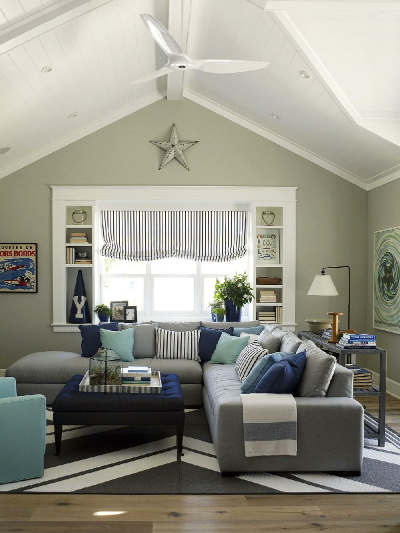
Gray works with every decorating style, from totally traditional to cutting-edge modern. Whatever the style, "gray can be a huge statement," Ranize says, so it "doesn't take a huge quantity of accents to get high impact."
It also works surprisingly well in rooms where you might not expect it: Betsy Burnham, founder of Burnham Design in Los Angeles, uses dark gray kitchen cabinetry painted with a slightly shimmery satin finish. She likes using a softer shade, Benjamin Moore's "Gray Owl," on walls, and painting the trim a crisp, cool white.
Designer Brian Patrick Flynn, founder of Flynnside Out Productions, uses gray "to mediate other more dramatic colors."
"If I am using a lot of black," he says, "I'll pair it with greige to keep the look more subtle and almost lower the amount of contrast. If I'm working with bold colors such as red or orange, I'll usually set them against a backdrop of dove gray or blue gray."
Another combination he recommends: charcoal gray with dark hunter green and black. "All three are super-dark and rich," Flynn says, but "none are really too high-energy, resulting in a sense of glamour that's somewhat rustic and woodsy. It's a really unique look that can be pulled off in the right setting."
Gray is even kid-friendly. It's "an excellent choice for a gender-neutral nursery or kid's room," Flynn says, "since you can accent it with a wide array of colors."
Yet another option: Ranize loves mixing grays
with deep shades of plum and any deep blue, from navy to teal. Deep blues "can play off of
light grays so pleasantly," she says. It brings "emotional impact without being over the top."
WARM AND BRIGHT
Gray doesn't have to make a room feel depressing or cold. "There are ways to bring it outside of that stark, off-putting, cloudy-day kind of vibe," Burnham says. Her favorite strategy is using warm shades of gray alongside organic items like pottery, plants, and natural-wood floors and furniture.
As you choose a gray hue, consider the room's natural light. If you're worried that a gray room will look dim, choose items that reflect light. Look for a woven silk rug, wallpaper with a subtle sheen, upholstery with a slight shimmer, and even a tabletop of pale gray or gray and white marble that reflects light.
You can also opt for lighter grays to keep things from getting too intense. If you're considering using gray with red, for example, Flynn recommends dove gray or blue gray rather than charcoal. "Since dark gray and red are both super-dramatic, they can sometimes come across as overbearing or too much," he says. By pairing red with paler grays, the effect is "light and airy, juxtaposed with dramatic and high-energy."
THE BEST BASE LAYER
Rather than adding gray to a room as an accent color, Ranize suggests using it as the room's base color. She recommends using paint or wallpaper to create soft gray walls, then layering more shades of gray into the room in the floor-covering and furniture. As a finishing touch, add a few dabs of other colors as you wish.
With this technique, she says, "you get this dynamic space without trying to be flamboyant."
If you're building a new house, talk with your builder about using gray as the base color throughout the property.
"Builders and real estate agents are big on using beiges, creams and taupes to neutralize their properties," Flynn says, but "interior designers take the more personable route with gray, a color which has more personality."
HomeStyle on 10/31/2015