Every autumn, the major paint brands name colors they think will dominate decorating trends the following year. So far, 2017 looks fancy. There's Dunn-Edwards's Honey Glow, Benjamin Moore's Shadow and Pratt & Lambert's Leafy Bower -- confident, saturated jewel tones designed to make a bold statement or evoke a sense of glamour. After a five-year fixation with gray, these are certainly exciting choices.
Of course, the point of naming a color of the year is to stir up buzz, but the process is surprisingly thorough. Brands invest in full-time color experts who attend trade shows, analyze sales data and examine everything from fashion trends to fine art before making a decision they say reflects our collective mood. Sara McLean, the stylist for Dunn-Edwards, said she took into consideration the election, wellness trends, the Olympics and even Beyonce's "Lemonade" before landing on Honey Glow's "uplifting energy."
"It's a fresh start after an exhausting year," she said. No kidding.
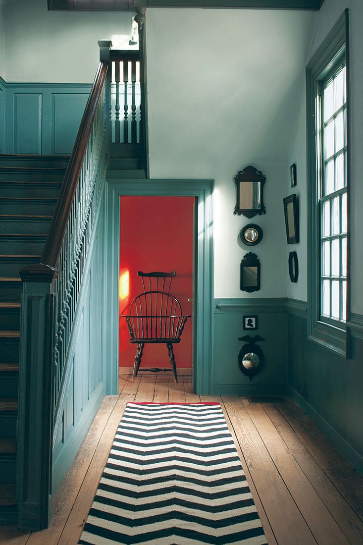
But if you think the whole idea of yearly paint trends is a bit ridiculous, you're not alone. It's hard to imagine repainting your living room at the same rate you buy handbags, never mind trying to rematch your furniture to deep-purple paint. For a more understated and low-maintenance palette, consider historical paint lines. There, you'll find colors that have truly stood the test of time.
"It's about authenticity. It's the anti-McMansion approach," said Sue Wadden, director of color marketing at Sherwin-Williams in Cleveland. "People are staying closer to the city or renovating old homes, and historic colors are a storyteller moment."
So what qualifies as a historical color? For some brands, it's a loose definition. Pratt & Lambert's Colonial collection reflects "the European heritage of Colonial Americans, from English Tudors to Swedish Cabins," according to its color card. Other brands take it literally and seriously, hiring teams to study thousands of photographs, documents, paint samples, drawings and even old building fragments dating back hundreds of years.
Benjamin Moore's 144-color Williamsburg Collection was developed with the Colonial Williamsburg Foundation in 2013 after studies revealed that historical pigments were "more saturated than originally thought." It's slightly richer than the brand's other historical lines, but all have concrete historical references. Capitol White, for example, nods to orders in Virginia's Colonial records to paint buildings with white oil paint.
When Dunn-Edwards added 300 colors to its offerings last year, half were historical hues honoring the American Southwest that took McLean and an architecture firm five years to develop. And at the 150-year-old Sherwin-Williams, research is handled by on-staff archivists and historians who provide data and color suggestions for history-theme lines.
The woman who hired Wadden 20 years ago got as far as the 1950s. Now, Wadden is determined to pick up where she left off.
"There's midcentury modern, the moody '70s and the '80s," she said. "All the roses and mauve -- it'll be fun."
Historical colors are still a niche market, but brand representatives say demand has increased with the popularity of city living. In other words, these collections aren't just for purists and preservationists. For those living near vibrant design communities such as Pasadena, Calif., or Charleston, S.C., using colors that honor the neighborhood's history can foster a sense of community and belonging. "People want that authentic story," McLean says. "It gives their home character."
Ideally, historical colors should complement the material they're painted on, the mood of the room, and the environment or region. Although berry red looks charming on wooden doors in New England and rust-orange stucco feels right at home in the Southwest, the reverse can be tricky, says Alisa Smith, a Los Angeles-based color expert and design consultant specializing in renovations of historic homes. For a more reserved palette, warm whites such as Farrow & Ball's White Tie are an elegant accompaniment for Federal-style antique furniture. And Pointing, a similar shade, was named after the lime pointing in traditional brickwork.
Smith says there are misconceptions about historical colors that keep them from being used more often, namely that they're all neutrals and force you to sacrifice your personal style.
"I take the history into account and then try to push it forward because I don't believe we want to live in a time capsule," she said. "It's actually a big fight I have with preservation societies out here. But it's really about balance."
On that note, Wadden says it's completely fine to have a house that's historical on the outside and modern on the inside. "Purists would insist that homes be accurate and consistent from wall to wall, but that's a real commitment," she said. "I say, have some fun with it and do what feels right for you. Otherwise, you'll really be repainting in a year or two."
Eight top-selling paints
• Roycroft Copper Red, Sherwin-Williams: A farmhouse red that Wadden says "looks great on a front door or intimate room.
• Sudbury Yellow, Farrow & Ball: Named after a staircase at Sudbury Hall, a historic house in Derbyshire, England, this muted ochre is based on a color humans have decorated with for "thousands of years," Smith says.
• Kemp Kelly, Dunn-Edwards: A shamrock green based on the interior of the Kemp House in Los Angeles, an Arts and Crafts-style house built in the early 20th century.
• Sunbaked Adobe, Dunn-Edwards: A desert hue inspired by the King House, a pueblo revival house in Phoenix.
• White Tie, Farrow & Ball: Smith calls this classic off-white "foolproof" for rooms with antique furniture and recommends Pointing trim, a great choice for Federalist-period houses.
• Williamsburg Wythe Blue, Benjamin Moore: A popular pick from the brand's Williamsburg Collection, this calming blue-gray was developed with historians in Colonial Williamsburg and based on pigments from the 18th and 19th centuries.
• Capitol White, Benjamin Moore: A nod to the Virginia Colonial Records Project, which recommended public buildings be painted with white oil paint.
• Studio Green, Farrow & Ball: A deep green so rich that it can appear black on color cards, and the original color of the Farrow & Ball Studio, hence the name.
HomeStyle on 11/12/2016