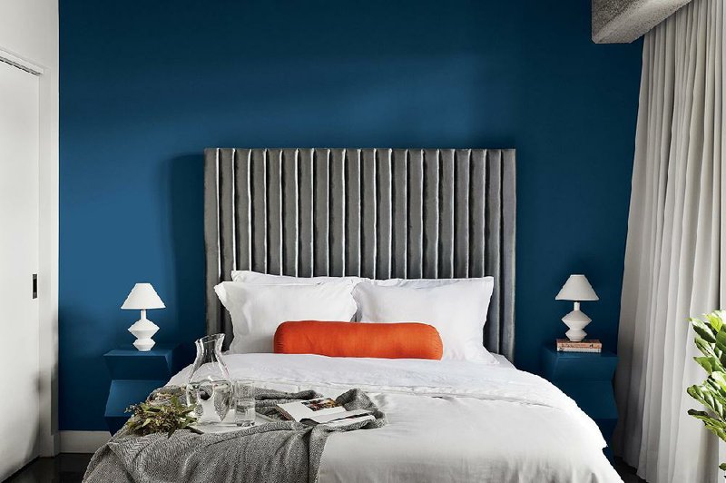
In announcing Classic Blue the Color of the Year for 2020, Pantone Color Institute, a leading authority on color trends, stated: “Instilling calm, confidence, and connection, this enduring blue hue highlights our desire for a dependable and stable foundation … as we cross the threshold into a new era.”
Wow. It just looks like blue to me.
But wait. Behr, The Home Depot’s paint brand, declared Back to Nature, as the 2020 COTY (that’s industry shorthand for Color of the Year), “a restorative and revitalizing green hue that engages the senses.”
Meanwhile, Benjamin Moore & Co. chose First Light, “a warm, rosy pink that symbolizes an upbeat and hopeful start to the next 10 years.”
Would the real Color of the Year please stand up?
The fad frenzy started when Pan-tone came out with its first Color of the Year in 1999. The announcements soon became national news, prompting paint companies to name colors of the year and draw attention to their brands. Now, we have nearly a dozen paint companies announcing their COTYs, vying for attention. Every year, it gets worse.
Are they painting us all as fools? If
could help me make sense of the hue and cry, I thought, it would be an art professor and textile designer I took a color theory class from over 20 years ago at UCLA. I tracked Michael Schrier down through Otis College of Art and Design, in Los Angeles, where he continues to teach color theory to tomorrow’s artists and designers, and asked him what we mere consumers were to make — if anything — of these au courant colors.
Marni: Nobody in their right mind is going to repaint or redecorate based on one company’s Color of the Year, which, by design, will change next year, so what are we supposed to do with this information?
Michael: Make no mistake, stated color trends are for marketing purposes, but that’s not all bad. Colors of the year may draw you in to look at a particular paint color, but more helpful is seeing the color palettes companies put with that color. When you look at palettes, you see a sequence of colors that relate. That secondary color story can help you choose colors for your home that you respond to. And, because they work so well together, they will be stable for a long time.
What’s trending up or down isn’t as important as discovering what appeals to . Because the trend will be over with, but you won’t be.
Q: So the benefit of looking at the COTYs is to look past them to what they are being featured with?
A: Trends are at their best when they trip an idea and let you see your space in new ways. And there’s nothing wrong with that. The palettes are a wonderful, easy way to give people confidence and confirmation that certain colors work together. This access to palettes wasn’t available to consumers five years ago. But the way color is presented in the market today can cut out the need for a designer.
Q: So how can we use a trend color in our home, knowing that it’s, in fact, a trend?
A: If you’re indeed trying to have some relationship to a trend, look at what you have and try to spot the color into your environment. Add some Classic Blue with a vase or a pillow. Choosing color accents from among those you already have will be better than going into Home Goods or Target and choosing six accessories that happen to be the color du jour.
Q: What color mistakes would you like to see do-it-yourself decorators avoid?
A: A home where everything is of the same color value, where there’s no differentiation, and all the colors are of one note.
Q: In class, you told us what every room should have, and made us design a room’s color board accordingly. Is your must-have list the same?
A: It hasn’t changed. All rooms should have a color that is high in value and one low in value, (something light and something dark), a warm color and a cool one, a neutral, and a spike — a punch of something surprising that energizes the space like a bit of cranberry, a leopard-print pillow, a cut crystal bowl that refracts the light. Spikes catch the eye.
Q: What do you wish more home decorators knew about color?
A: Have your own sense of identity in terms of how you want to use color in your environment. That alone should guide your choice, not some trend. That doesn’t mean you shouldn’t look at trends or pay attention. If you’re at a loss for what to do, trend color palettes can offer some guidance, but make decisions based on what you respond to.
Q: What is design success?
A: Design implies intention, and intention implies thought, no matter what the color is. When you walk into a home that has a great current color palette and no intention, it feels hollow. If someone comes into your space and feels that you’ve put it together with thought and intention and that it expresses you, whether it’s trendy or not, that’s success.
Syndicated columnist Marni Jameson is the author of five home and lifestyle books, including the just-released Downsizing the Blended Home — When Two Households Become One (Sterling Publishing, Dec. 2019)