Like many do-it-yourself decorators, I'm always on the lookout for ways to bridge the gap between my limited skill set and the world of fine design. I look for what great designers know that the rest of us don't, like how to pull off daring pairings of color.
Often do-it-yourself decorators get the furniture plan right, nail the neutrals, and install the right fixtures, but then cringe like the Cowardly Lion when choosing color. Afraid of making a mistake, of mixing colors that "don't go," even the bravest do-it-yourselfers timidly default to neutrals and maybe one accent color. The result? Safe and boring interiors. Yawn.
Well, here's a leaf from the designers' color-courage handbook: When looking to combine colors, remember opposites attract.
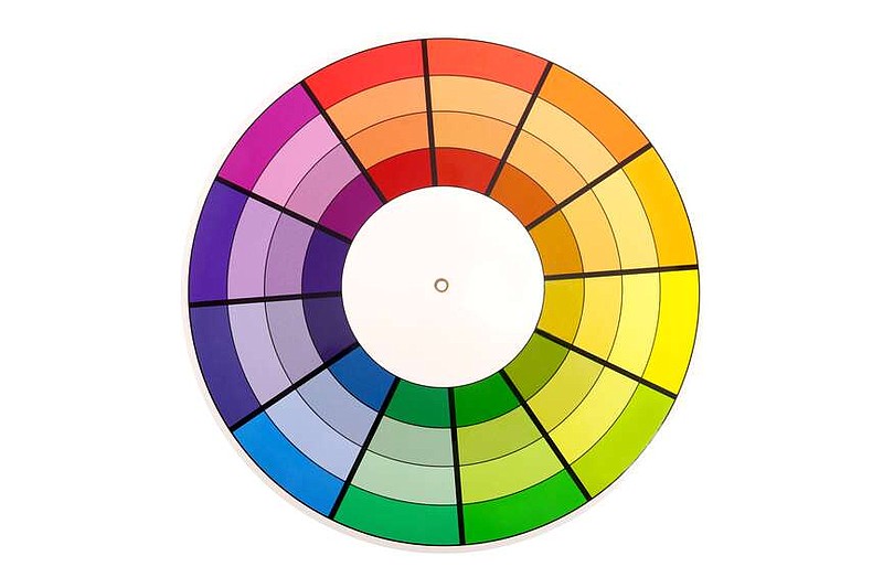
Let's go back to grade school for a moment. Remember the color wheel, that round rainbow that radiated all the colors? We learned how the primary colors -- red, blue and yellow -- mixed to form the secondary colors -- orange, violet and green -- and their hybrids: red-orange, blue-violet, yellow-green, and so forth.
We learned from some art teacher or maybe a parent that colors could be warm or cool, making us puzzle over a temperature we could see but not feel. We learned that color affects mood; it can calm or energize. This, honestly, is where the lesson got a little out there.
Then came the explanation of complementary colors, those opposite each other on the color wheel, which had an "extra special" relationship, like the sun and the moon.
I don't know about you, but that was the point when I started scratching my head with a No.2 pencil thinking privately those colors looked terrible together. Who but an elf at Christmas would wear bright red and green?
It took me years, and more school, to figure out what the big complementary fuss was about, to discover that indeed if you want to create rooms that cohere color-wise you need complementary colors to collide. Designers know, and now you do, too, if you want to take a room from ho-hum to fabulous, from asleep to alive, if you want to make a room snap, you need to inject opposite colors.
Blue is the zig to orange's zag. Yellow is the yin to purple's yang.
But, you say, you don't like red and green together, except on a Christmas tree. Purple with yellow is gaudy, and blue next to orange only works for sports teams. I get that. What you're forgetting, however, is that colors come in shades, many shades. Red ranges from the deepest burgundy to the palest pink. So, rather than cherry red and leprechaun green, picture an emerald velvet loveseat set against a ballet-slipper-pink wall, or celery-green-tweed chairs in front of a red brick hearth. Imagine an eggplant leather chair alongside linen drapes the color of butter, and pale aqua towels displayed against a coral wall. You get the idea.
Complementary colors work together because -- without getting too scientific -- they each have (spectrum-wise) exactly what the other is missing. Like a well-matched couple, together they are complete. (Hence the word complementary, not complimentary, to flatter.) Complementary colors work because they bring out the best in each other. Blue makes orange more orange. Yellow enlivens violet. Together they create what designers call visual tension, a good kind of tension, the way a riveting plot holds a book together, or suspense binds a movie.
All to say, if you want to kick your home decor up a notch, use colors that live across from each other on the color wheel. Here's how:
◼️ Consult the color wheel. If your rooms are boring, and you're not sure why, look at the colors in each room. Identify the neutrals -- the creams, whites, browns, grays and tans -- then see what's left. Maybe nothing? Maybe one main accent color in varying shades? Maybe a discordant jumble? Now revisit the room's color scheme. Choose one accent color to emphasize, say teal, then look across the color wheel and consider adding a touch of its opposite, like pumpkin or apricot.
◼️ Be open-minded. Consider the range of shades that belong to each color, from the deepest version to its most hushed tone. Each shade can work harmoniously with a partner color of any intensity on the other side.
◼️ Avoid the 50/50 split. You don't want to represent colors equally. The 60-30-10 design rule is a good one. Have 60% of your room a main neutral color like sand, 30% a secondary color like plum, and 10% a complementary accent like mustard yellow.
◼️ Go beyond throw pillows. While accent pillows are a great way to add color, consider adding color on walls, or with rugs, art, upholstery, accessories or drapery.
◼️ You can still be cool. Although pairing opposites always means mixing warm and cool colors, you can still have a room that feels predominantly cool or warm. A calm bedroom decorated in shades of mint and eucalyptus, for instance, can benefit from a splash of salmon or terracotta. Conversely, you can have a sunny yellow kitchen accented with touches of periwinkle, and still have a warm ambience.
◼️ Say it with flowers. One of my favorite ways to inject a complementary color in a room is with a simple bunch of single-color flowers, such as a bunch of orange tulips in a pale blue bedroom, or pink roses in a hunter green study.
Now go ahead and dare to pair.
Marni Jameson is the author of seven books, including "Rightsize Today to Create Your Best Life Tomorrow."
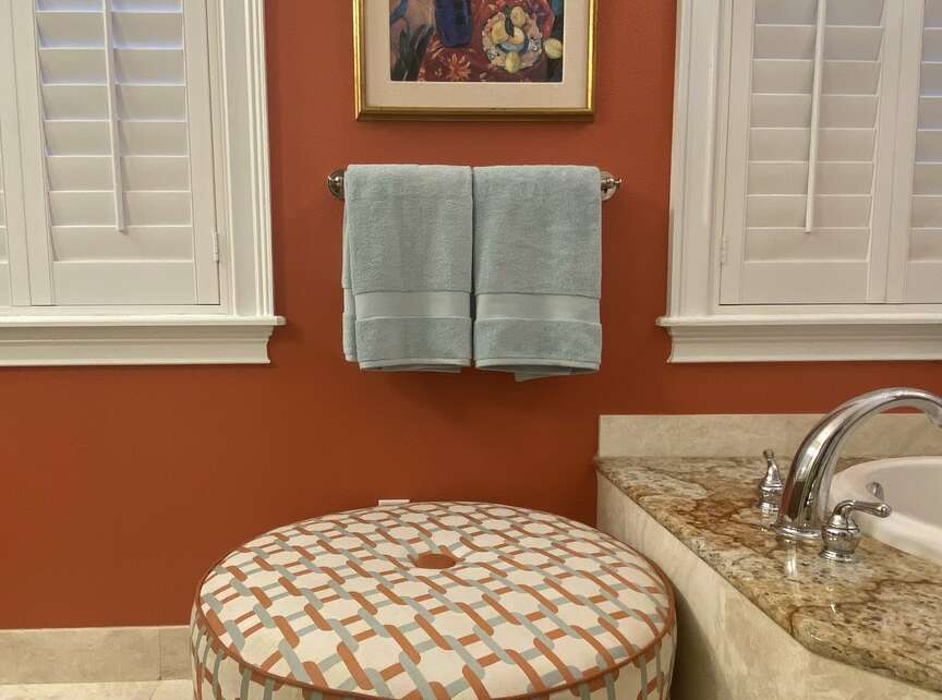 This combination of intense coral orange and pale aqua works because these colors are opposite each other on the color wheel. (Courtesy of Marni Jameson)